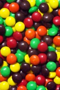
In marketing, perception is reality. In the mid-1970s, health concerns arose over the use of the dye amaranth, commonly known as FD&C Red #2. Studies linked the popular food coloring with cancer. Mars Inc., makers of M&M’s, decided in 1976 to replace red M&M candies with orange ones. Did the candymaker eliminate red M&M’s because […]
Category Archives: Branding
Lessons from Google’s new Chrome icon
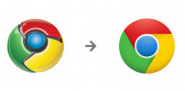
This week, Google unveiled a new, simpler icon for its Chrome web browser. In a blog post explaining the change, Google designer Steve Rura wrote, “Since Chrome is all about making your web experience as easy and clutter-free as possible, we refreshed the Chrome icon to better represent these sentiments. A simpler icon embodies the […]
Appearances are everything when it comes to your online brand

Appearances are critical in business… especially online. Your potential customers want to know if your website looks trustworthy. We’ve all heard the phrase “the appearance of impropriety.” The last thing any of us wants is to have that phrase linked to our companies and their websites. I saw a quote in Website Magazine that sums […]
Change — and controversy — are brewing at Starbucks
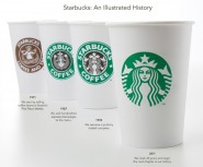
Starbucks has decided to rid itself of the bothersome words “Starbucks Coffee” in its logo and leave behind only their green mermaid. The company says it’s making the change because it sells more than coffee. This is a pretty familiar issue to printers who debate changing their name from SomeName Printing Company to SomeName Marketing […]